I read a lot of blogs and articles online. Like most young (ish) adults it is where I get all of my news and information. In general I read a lot about start ups and being an entrepreneur, mainly business consulting and technology.
So naturally I see a lot of sites trying to get you to signup for a newsletter, service, or buy a product. Which is totally fine. The business worked hard to get me to their site, instead of advertising other businesses, it is best to advertise their own. Most of the time there might be a pop up I need to close out of. Maybe some advertising on the side. A signup box for a newsletter on the bottom of the article. All pretty standard and acceptable forms of self promotion. But today I came across a site that took what is acceptable and ran it over with a truck then set it on fire.
The tactics were not only intrusive but when I stopped reading the article for a moment to check an email I was hit up again! Now I’m not bashing this websites content, and maybe this works for them in getting subscribers but to me it is a good way to push users away. It just screams “I don’t care why you are here. Subscribe/Buy from me. NOW!”
Here is a screen shot from when I first opened the article.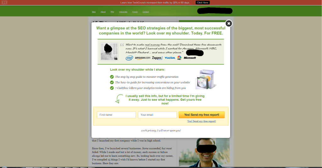 Annoying pop up, but it is common place for these type of sites. Close out of it and I see a well placed newsletter sign up form, I noted it with a blue arrow in the below image. Over all the ad is actually pretty good. It has a good catch, pretty easy to understand. Acceptable.
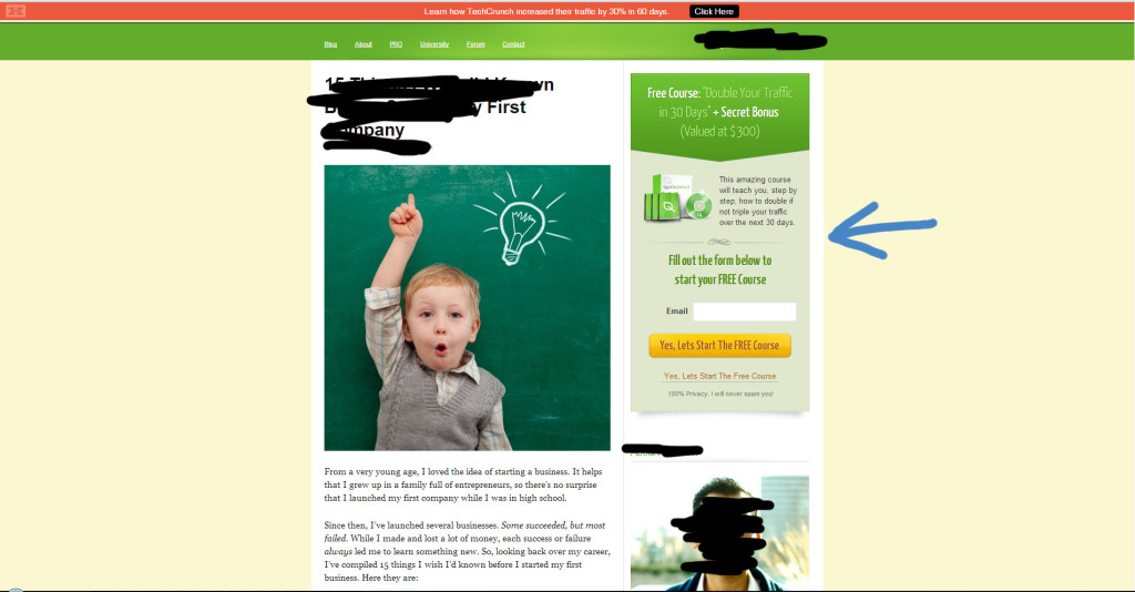
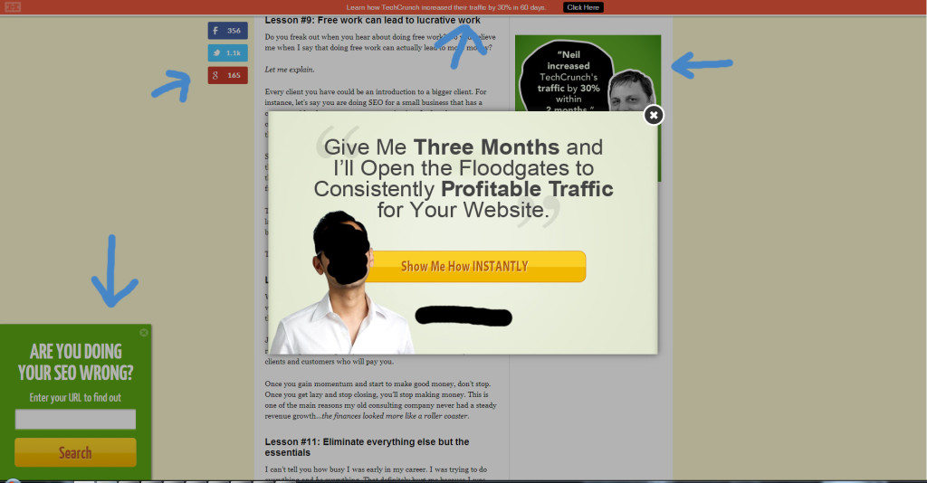
As I scroll down the page several things happened. The top pink bar stayed at the top of my browser. The social media icons appeared. The green ad on the right with the face followed me as I scrolled. As I got towards the bottom of the page the ad on the bottom left popped up. I’m starting to feel like that want me to do something. Then I received an email I was waiting for. I moved my mouse to click on my email. Upon moving my mouse off of my browser, bam, another pop up in the middle of the page. Really?!
I’ve had enough, time to close the article. I didn’t even read it all because they did such a good job of alienating me that what ever they had to say, I could care less about. That’s the perplexing thing. The site is about SEO and getting mass amounts of traffic. They spent a lot of time doing SEO to get me to come to their site just to annoy me so much that I leave.
It doesn’t stop there. Now I’m curious as to what else they are going to try. I click on one of their services on the top navigation bar. I get to this page in the image below.

The navigation bar disappears. I have no where to go. I click my back browser button only to be stopped by an alert asking me if I really want to leave. Yes I want to leave! But clicking on “leave this page” didn’t take me back to the article. It took me to another buy from me page! Argh! *Close browser.
It is fine to push your own services. After all, you have worked so hard in getting users to your site, why advertise another business? But be mindful and respectful of your users. The sad thing is not everything this site does is bad. It is that they went over board.
- Unintrusive newsletter sign up on the side of the site – Good.
- Sticky Header – Ok.
- Advert that scrolls down the page with you – Ok.
- Newsletter/Service sign up pop up when you scroll to the bottom of the page – Ok.
- Newsletter/Service sign up when you first visit the site – Meh.
- Newsletter/Service sign up when you move your mouse off the browser – Bad.
- Stopping users from leaving a page with an alert box – Bad.
- When the user clicks the back browser button, take them to a “buy from me” page instead – Bad.
Just remember, it only take one annoying website issue to turn a user off forever. So why make that decision for them?